Case Studies · Enterprise Digital Ops
Real Projects, Shipped at Scale.
Five projects from my time running digital merchandising and launches at a national telecom brand. Pricing launches, page audits, new builds and big cross-team releases. Client names and screenshots are left out for confidentiality, and I’m happy to walk through the details on a call.
01 · Net-new capability · Pricing launch
Building-specific pricing, sold online for the first time
- Client
- National telecom brand
- Role
- Campaigns and operations specialist
- Teams
- Digital, Product, Pricing
- Tools
- Contentful, Jira
- Year
- 2025
The goal
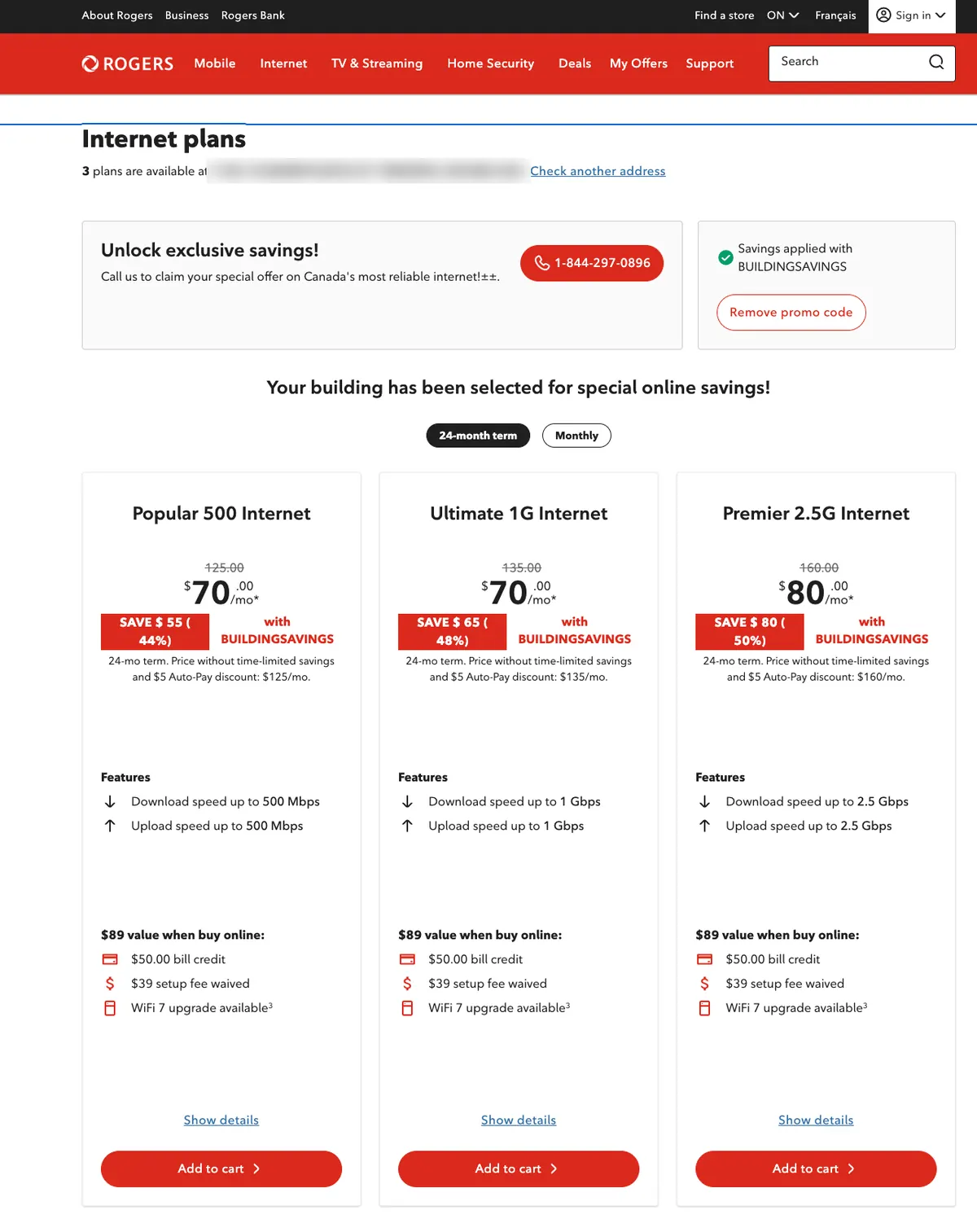
Apartment and condo residents could get special building-specific internet rates, but only by calling or visiting a store. There was no way to buy them online: the promo codes weren’t set up for digital, and nothing showed the savings to customers shopping on the website.
What I did
- →Audited which promo codes were ready for online use and flagged the ones that still needed setup
- →Worked with the Pricing team to get the configuration files built and pushed through intake
- →Confirmed the codes were loaded into testing and validated before launch
- →Owned the bundles workstream end to end, from setup through to live
What shipped
A customer in a qualifying building enters their address and the building discount applies automatically. All three internet plans show the savings right on the plan cards.
First
online self-serve path for this pricing
44 to 50%
savings shown across three plan tiers
2
promo programs set up, tested and live
The screens
02 · Page audit · Refresh
A product page audit that became a full refresh
- Client
- National telecom brand
- Role
- Digital merchandising
- Teams
- Product, UX, Content
- Tools
- Contentful, Jira
- Year
- 2025
The goal
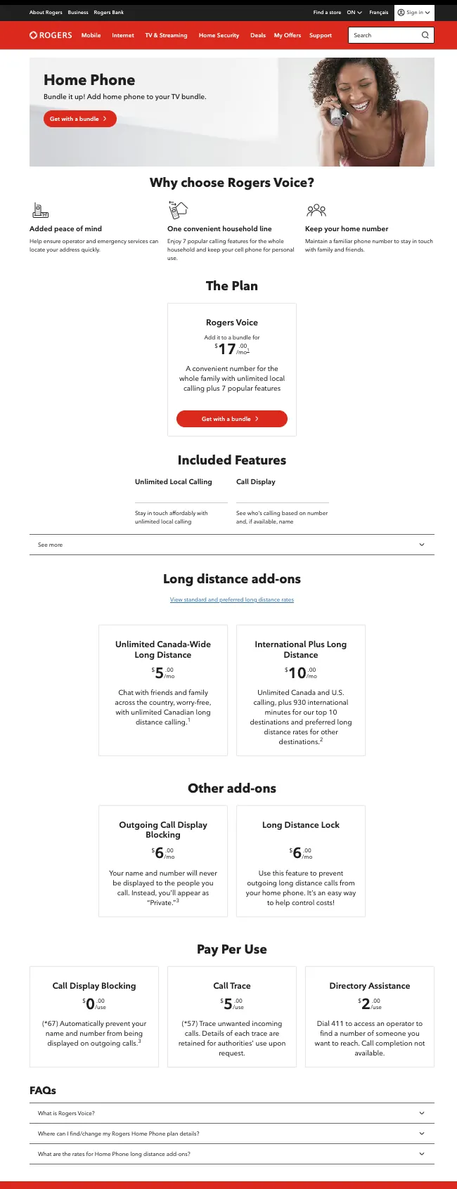
A product owner flagged the home phone page as underperforming. Most features were hidden behind a toggle, long-distance rates were a static link, and nothing addressed the two biggest worries for people switching: keeping their number and getting set up.
What I did
- →Ran a full content audit covering messaging, pricing presentation and merchandising accuracy
- →Reviewed layout, visual hierarchy and the customer journey with the UX team
- →Turned the findings into a clear list of content and CMS changes
- →Coordinated delivery across the product, UX and content teams
What shipped
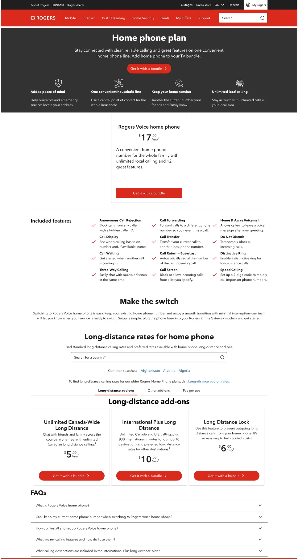
A clearer, value-led hero. Value props expanded from 3 to 4. All 12 included features shown instead of 2. A new “Make the switch” section on keeping your number and setup. A country search tool for long-distance rates, and tabbed add-ons.
2 to 12
features visible on the page
3 to 4
value props in the hero
Live
refresh built from the audit
The screens
03 · Net-new build · Regional content
A new regional page after an acquisition, plus a refresh of the original
- Client
- National telecom brand
- Role
- Digital merchandising
- Teams
- Product, UX, Content
- Tools
- Contentful, Jira
- Year
- 2025
The goal
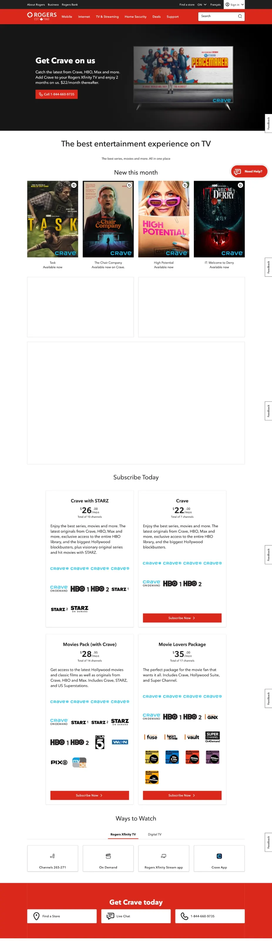
After an acquisition brought in new western markets, customers there had no dedicated page for a premium streaming add-on, only a line on a long add-ons list. No search presence, no brand story and no way to convert. The original eastern page had its own problems: a hero that went blank between campaigns and broken video embeds leaving big white gaps.
What I did
- →Audited the original page and documented the content, UX and merchandising gaps
- →Built the western page from scratch in Contentful, showing the right version to each region’s customers
- →Led the content and messaging for the new page, with an offer-led hero tied to TV bundles
- →Replaced the broken video embeds with a stable content carousel
- →Coordinated delivery across the product, UX and content teams
What shipped
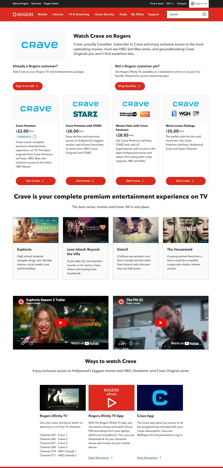
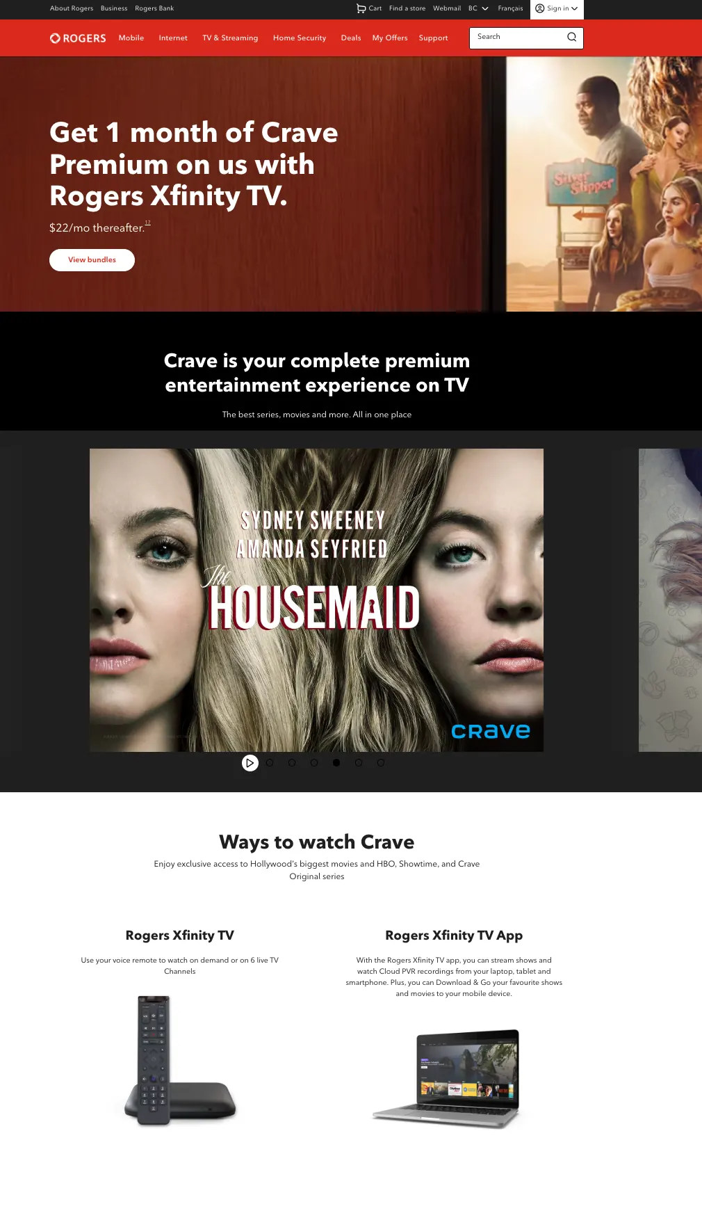
Western: a brand-new page with an evergreen offer, the first page in those markets that search engines could find. Eastern: an evergreen hero, a stable carousel, separate paths for existing and new customers, and cleaner plan cards.
New
revenue page where none existed
2
region-aware experiences, live
0
broken embeds left on the page
The screens
04 · Product launch · 20+ workstreams
Home security plans launch across 20+ workstreams
- Client
- National telecom brand
- Role
- Digital lead, eastern learn pages
- Teams
- Product, Marketing, UX, IT, Content, Pricing, Legal, Sales, Comms
- Tools
- Contentful, Jira
- Year
- 2025
The goal
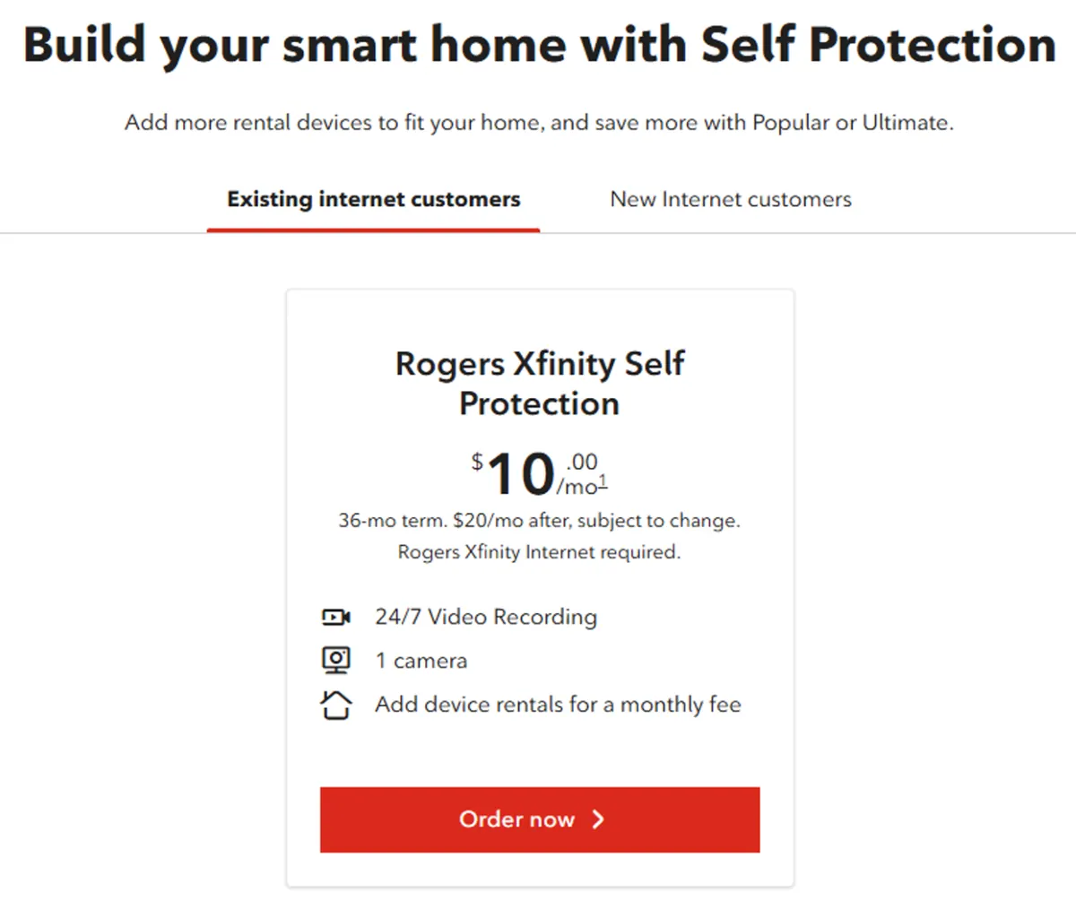
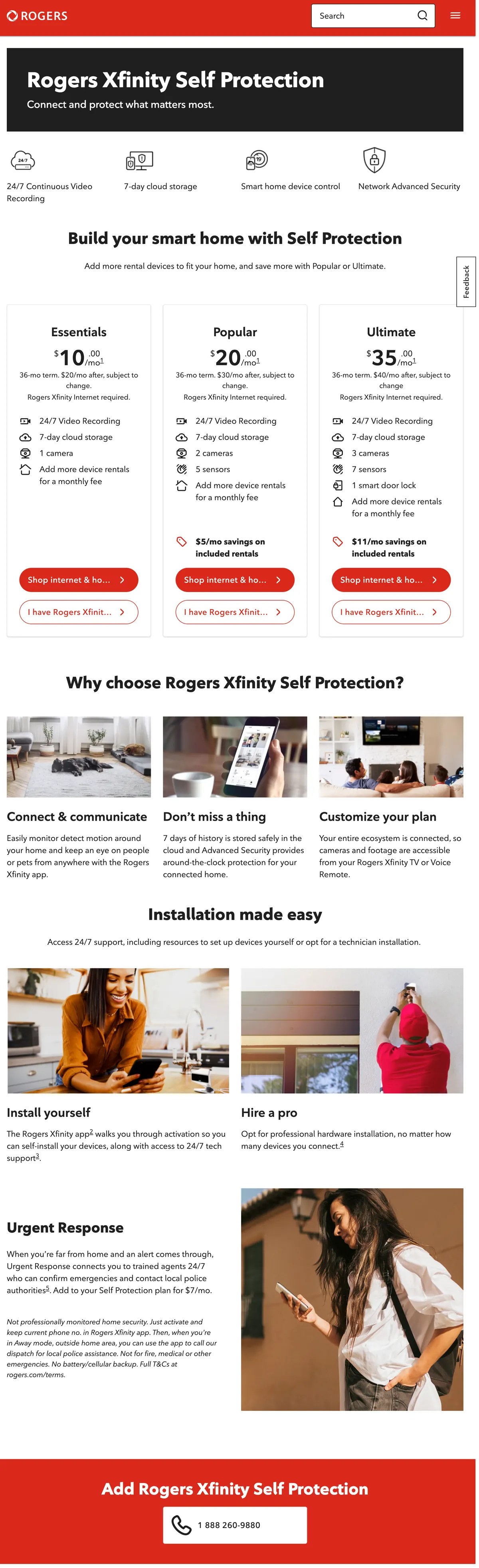
One of the company’s largest home security changes: a single plan replaced by three tiered bundles at promotional prices. The old page hid pricing behind tabs that made customers say whether they were new or existing before they could see anything.
What I did
- →Named the digital lead for the eastern learn pages, accountable for content and merchandising accuracy at launch
- →Tracked readiness across 20+ workstreams to a fixed go-live date
- →Reviewed copy on all three plan cards so pricing, savings and features were accurate and on brand
- →Pushed to remove the new versus existing customer tabs so every visitor saw pricing right away
- →Made all content updates in Contentful and handled the follow-on release
What shipped
All three plans shown side by side with clear buttons and no tabs in the way, launched in two regional phases, both on schedule.
12 to 18%
more page engagement during launch
7 to 10%
less drop-off in the buy flow
2
launch phases, both on schedule
The screens
05 · Stakeholder negotiation · Taxonomy
International channels page redesign
- Client
- National telecom brand
- Role
- Digital merchandising
- Teams
- Marketing, Product, UX, Content, SEO
- Tools
- Contentful, Jira
- Status
- Approved at design stage
The goal
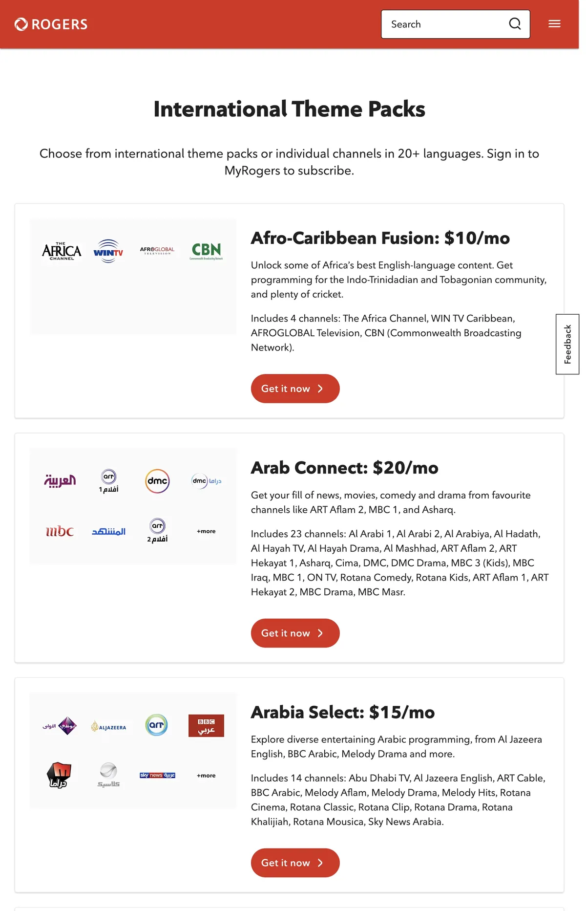
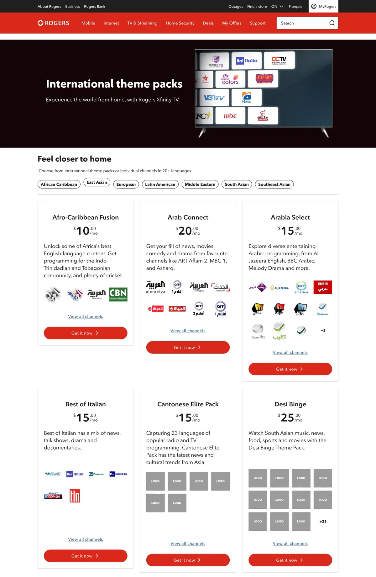
Marketing saw the international channels page as underperforming. It was a flat list of 20+ language packs with no story, no search optimization and no way to browse.
What I did
- →Steered the stakeholder away from a copy-heavy hero toward a short, emotional one using approved brand lines
- →When a language dropdown wasn’t possible on the platform, proposed region filter tabs that met the same goal
- →Designed a regional taxonomy: 7 regions covering 20+ packs
- →Worked high-volume keywords from SEO research into the copy and page title
What shipped
A redesign agreed with Marketing: a branded hero, “Feel closer to home” positioning, region filter tabs and a cleaner three-column grid. Signed off at the design stage before I left the role.
7
regions organizing 20+ packs
2
stakeholder requests reworked to fit the platform
Approved
design signed off by Marketing
The screens
Let's talk
Need this kind of work on your team?
I take on contract work by the sprint, the month or the hour. Local business owner? My services for small businesses are on the homepage.